I've seen this mistake many times where people put up just a big banner image and a link "Click here to enter" on their homepage. The worst case — the "enter" link is embedded in the Flash object, which makes it impossible for the spiders to follow the link.
This is fine if you don’t care about what a search engine knows about your site; otherwise, you're making a BIG mistake. Your homepage is probably your website's highest ranking page and gets crawled frequently by web spiders. Your internal pages will not appear in the search engine index without the proper linking structure to internal pages for the spider to follow.
Your homepage should include (at minimum) target keywords and links to important pages.
2. Non-spiderable Flash Menus
Many designers make this mistake by using Flash menus such as those fade-in and animated menus. They might look cool to you but they can’t be seen by the search engines; and thus the links in the Flash menu will not be followed.
3. Image and Flash Content
Web spiders are like a text-based browser, they can't read the text embedded in the graphic image or Flash. Most designers make this mistake by embedding the important content (such as target keywords) in Flash and image.
4. Overuse of Ajax
A lot of developers are trying to impress their visitor by implementing massive Ajax features (particularly for navigation purposes), but did you know that it is a big SEO mistake? Because Ajax content is loaded dynamically, so it is not spiderable or indexable by search engines.
Another disadvantage of Ajax — since the address URL doesn't reload, your visitor can not send the current page to their friends.
5. Versioning of Theme Design
For some reason, some designers love to version their theme design into sub level folders (ie. domain.com/v2, v3, v4) and redirect to the new folder. Constantly changing the main root location may cause you to lose backlink counts and ranking.
6. “Click Here” Link Anchor Text
You probably see this a lot where people use "Click here" or "Learn more" as the linking text. This is great if you want to be ranked high for "Click Here". But if you want to tell the search engine that your page is important for a topic, than use that topic/keyword in your link anchor text. It’s much more descriptive (and relevant) to say “learn more about {keyword topic}” Warning: Don’t use the EXACT same anchor text everywhere on your website. This can sometimes be seen as search engine spam too.
7. Common Title Tag Mistakes
Same or similar title text:
Every page on your site should have a unique <title> tag with the target keywords in it. Many developers make the mistake of having the same or similar title tags throughout the entire site. That’s like telling the search engine that EVERY page on your site refers to the same topic and one isn’t any more unique than the other.
One good example of bad Title Tag use would be the default WordPress theme. In case you didn't know, the title tag of the default WordPress theme isn’t that useful: Site Name > Blog Archive > Post Title. Why isn’t this search engine friendly? Because every single blog post will have the same text "Site Name > Blog Archive >" at the beginning of the title tag. If you really want to include the site name in the title tag, it should be at the end: Post Title | Site Name. Exceeding the 65 character limit:
Many bloggers write very long post titles. So what? In search engine result pages, your title tag is used as the link heading. You have about 65 characters (including spaces) to get your message across or risk it getting cutoff. Keyword stuffing the title:
Another common mistake people tend to make is overfilling the title tag with keywords. Saying the same thing 3 times doesn’t make you more relevant. Keyword stuffing in the Title Tag is looked at as search engine spam (not good). But it might be smart to repeat the same word in different ways:
"Photo Tips & Photography Techniques for Great Pictures"
“Photo” and “Photography” are the same word repeated twice but in different ways because your audience might use either one when performing a search query.
8. Empty Image Alt Attribute
You should always describe your image in the alt attribute. The alt attribute is what describes your image to a blind web user. Guess what? Search engines can’t see images so your alt attribute is a factor in illustrating what your page is relevant for. Hint: Properly describing your images can help your ranking in the image search results. For example, Google image search brings me hundreds of referrals everyday for the search terms "abstract" and "dj".
9. Unfriendly URLs
Most blog or CMS platforms have a friendly URL feature built-in, however, not every blogger is taking advantage of this. Friendly URL’s are good for both your human audience and the search engines. The URL is also an important spot where your keywords should appear. Example of Friendly URL: domain.com/page-title Example of Dynamic URL: domain.com/?p=12356
With HTML5 video element, you can easily make it elastic by using the max-width:100% trick (see elastic HTML5 video demo). As mentioned in the introduction, this trick doesn't work if the embed code uses iframe or object tag which is commonly used by most video sharing sites such as YouTube and Vimeo.
The trick is very simple. You need to wrap the embed code with a <div> container and specify 50% to 60% padding bottom. Then specify the child elements (iframe, object embed) 100% width, 100% height, with absolute position. This will force the embed elements to expand fullwidth automatically.
To restrict the width of the video, an additional <div> wrapper is required. Wrap the video with another <div> tag and specify a fixed width value with max-width:100%.
Before we had the placeholder attribute, we relied on Javascript to fake the placeholder text. Below is an example. The text is inserted in the value attribute. On focus, it checks if the value is "search" and returns empty to clear the field. If the value is empty, it returns "search." As you can see, this way is not an efficient way because each field has to be checked.
Now with HTML5 placeholder, it is more semantic to use placeholder than value attribute. However, placeholder text is not supported by all browsers. To make it cross-browser, Modernizr and jQuery come in handy here.
Modernizr is used here to check if placeholder is supported. If placeholder is not supported, the jQuery code will run. It finds all elements with placeholder attribute and stores in a variable. It then compares the input value with the placeholder attribute. If the input value is empty, it will display the placeholder text and add a "placeholder" class to the input field. View Demo.
To use this on your site, download a copy of Modernizr and jQuery and paste the following code any where in your html page (be sure the jquery.js and modernizr.js file is in correct path).
<script src="jquery.js"></script>
<script src="modernizr.js"></script>

<script>
$(document).ready(function(){

if(!Modernizr.input.placeholder){

 $('[placeholder]').focus(function() {
   var input = $(this);
   if (input.val() == input.attr('placeholder')) {
  input.val('');
  input.removeClass('placeholder');
   }
 }).blur(function() {
   var input = $(this);
   if (input.val() == '' || input.val() == input.attr('placeholder')) {
  input.addClass('placeholder');
  input.val(input.attr('placeholder'));
   }
 }).blur();
 $('[placeholder]').parents('form').submit(function() {
   $(this).find('[placeholder]').each(function() {
  var input = $(this);
  if (input.val() == input.attr('placeholder')) {
    input.val('');
  }
   })
 });

}

</script>
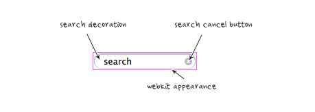
Remove Webkit Search Input Styles
Webkit browsers add extra styling to the search input field. To remove them, add the following CSS code:
This demo is intented to show you how to make a grayscale/color image hover effect with HTML5 and jQuery. To achieve this effect before HTML5, two images are required: a color and a grayscale version. Now HTML 5 made it easier and faster because the grayscale image is generated from the original source. I hope you will find this script useful in your design such as portfolio showcase, photo gallery, etc.
jQuery Code
The jQuery code below will look for the target images and generate a grayscale version. When hovering the image, it will fade the grayscale image into color.
<script src="jquery.min.js" type="text/javascript"></script>
<script type="text/javascript">

 // On window load. This waits until images have loaded which is essential
 $(window).load(function(){

  // Fade in images so there isn't a color "pop" document load and then on window load
  $(".item img").fadeIn(500);

  // clone image
  $('.item img').each(function(){
   var el = $(this);
   el.css({"position":"absolute"}).wrap("<div class='img_wrapper' style='display: inline-block'>").clone().addClass('img_grayscale').css({"position":"absolute","z-index":"998","opacity":"0"}).insertBefore(el).queue(function(){
    var el = $(this);
    el.parent().css({"width":this.width,"height":this.height});
    el.dequeue();
   });
   this.src = grayscale(this.src);
  });

  // Fade image
  $('.item img').mouseover(function(){
   $(this).parent().find('img:first').stop().animate({opacity:1}, 1000);
  })
  $('.img_grayscale').mouseout(function(){
   $(this).stop().animate({opacity:0}, 1000);
  });
 });

 // Grayscale w canvas method
 function grayscale(src){
  var canvas = document.createElement('canvas');
  var ctx = canvas.getContext('2d');
  var imgObj = new Image();
  imgObj.src = src;
  canvas.width = imgObj.width;
  canvas.height = imgObj.height;
  ctx.drawImage(imgObj, 0, 0);
  var imgPixels = ctx.getImageData(0, 0, canvas.width, canvas.height);
  for(var y = 0; y < imgPixels.height; y++){
   for(var x = 0; x < imgPixels.width; x++){
    var i = (y * 4) * imgPixels.width + x * 4;
    var avg = (imgPixels.data[i] + imgPixels.data[i + 1] + imgPixels.data[i + 2]) / 3;
    imgPixels.data[i] = avg;
    imgPixels.data[i + 1] = avg;
    imgPixels.data[i + 2] = avg;
   }
  }
  ctx.putImageData(imgPixels, 0, 0, 0, 0, imgPixels.width, imgPixels.height);
  return canvas.toDataURL();
    }

</script>
How to use it
To apply this to your site:
include a copy of jquery.js
paste the code as shown above
set the target image (eg: .post-img, img, .gallery img, etc.)
you may change the animation speed (ie. 1000 = 1 second)
Compatibility
It works with any browser that support HTML5 and Javascript such as Chrome, Safari, and Firefox. If HTML5 is not supported, it will fallback to original color image. Note: if it doesn't work with Firefox and Chrome locally. You need to put the HTML file on a web server.
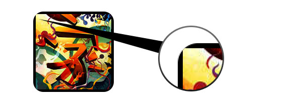
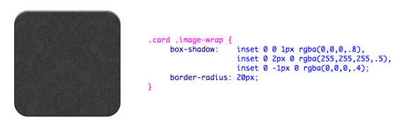
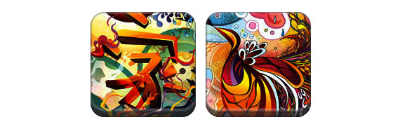
Take a look at the demo and note that there is border-radius and inset box-shadow applied in the first row of images. Firefox does render border-radius on image element, but doesn't render the inset box-shadow. Chrome or Safari doesn't render the border-radius and inset box-shadow at all.
Workaround
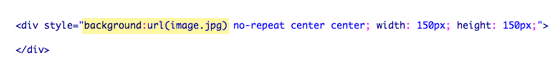
To get the border-radius and inset box-shadow working, the workaround is to apply the actual image as background-image.
Dynamic Way
To make it dynamic, you can use to jQuery to wrap the background image dynamically for every image element. The jQuery code below will wrap all images with a span tag and apply the image source as the background image (jQuery code by Darcy Clarke).
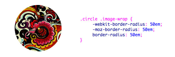
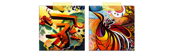
Now that the image is applied as a background image, you can pretty much add any style to it. Below is a simple circle image created with border-radius. If you are not familiar with CSS3, read my tutorial on the Basics of CSS3.
In this example, I added transition to the image wrap element. On mouse over, it will morph from rounded corners to circle and add a glowing effect. The glowing effect is done with multiple box-shadow values.
CSS
.morphing-glowing .image-wrap {
 -webkit-transition: 1s;
 -moz-transition: 1s;
 transition: 1s;

 -webkit-border-radius: 20px;
 -moz-border-radius: 20px;
 border-radius: 20px;
}

.morphing-glowing .image-wrap:hover {
 -webkit-box-shadow: 0 0 20px rgba(255,255,255,.6), inset 0 0 20px rgba(255,255,255,1);
 -moz-box-shadow: 0 0 20px rgba(255,255,255,.6), inset 0 0 20px rgba(255,255,255,1);
 box-shadow: 0 0 20px rgba(255,255,255,.6), inset 0 0 20px rgba(255,255,255,1);

 -webkit-border-radius: 60em;
 -moz-border-radius: 60em;
 border-radius: 60em;
}
This trick pretty much work on any browser (eg. Chrome, Firefox and Safari) that supports border-radius, box-shadow, :before and :after. The unsupported browsers will fall back to the image without any styles.
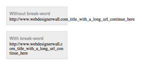
You can specify either normal or break-word value with the word-wrap property. Normal means the text will extend the boundaries of the box. Break-word means the text will wrap to next line.
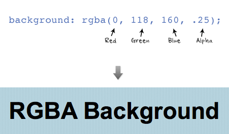
The first three values are RGB color values and the last value is the level of the transparency (0 = transparent and 1 = opaque).
RBGA can be applied to any properties associated with color such as font color, border color, background color, shadow color, etc.
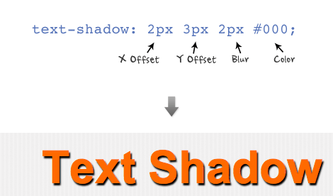
Text Shadow
Text shadow is structured in the following order: x-offset, y-offset, blur, and color;
Set a negative value for x-offset to shift the shadow to the left. Set a negative value for y-offset to shift the shadow to the top. Don't forget you can use RGBA values for the shadow color.
You can also specify a list of text-shadow (separated by a comma). The following example uses two text-shadow declarations to make a letter press effect (1px top and 1px bottom). text-shadow: 0 1px 0 #fff, 0 -1px 0 #000;
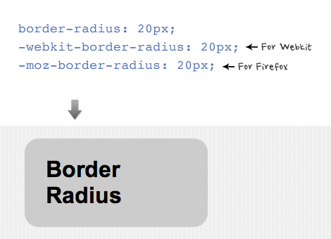
Border Radius
The shorthand for border radius is similar to the padding and margin property (eg. border-radius: 20px). In order for the browsers to render the border radius, add "-webkit-" in font of the property name for webkit browsers and "-moz-" for Firefox.
You can specify each corner with a different value. Note Firefox and Webkit has different property names for the corners.
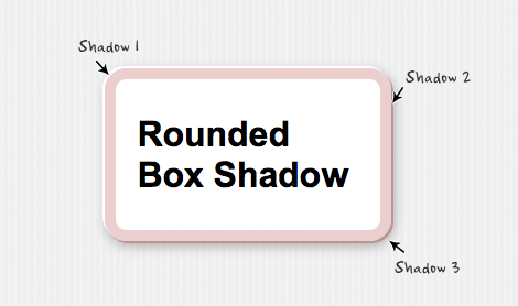
Box Shadow
The structure for box shadow is same as the text-shadow property: x-offset, y-offset, blur, and color.
Again, you can apply more than one box shadow. The following example is a list of three box shadow declarations. -moz-box-shadow:
-2px -2px 0 #fff,
2px 2px 0 #bb9595,
2px 4px 15px rgba(0, 0, 0, .3);
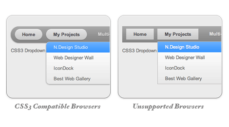
The image below shows how the menu will look if CSS3 is not supported.
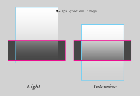
One Gradient Image is Used
A white-transparent image is used to achieve the gradient effect. Because the new CSS3 gradient feature is not supported by all browsers yet, it is safer to use a gradient background image.
The instensitiy of the gradient can be changed by shifting the background image up or down. Also, the gradient color can be easily adjusted by changing the background color.
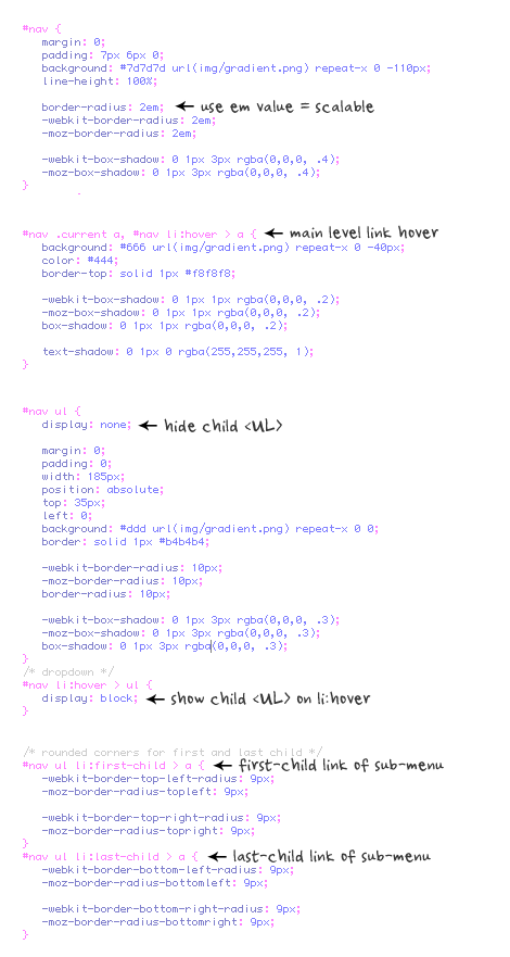
CSS Code
I'm not going to explain the CSS line by line. The images below explain the key points on how this dropdown is coded.
Update Apr 13 2010: Pure CSS Dropdown (No Image Used)
The following demo used CSS gradient and IE gradient filter instead of the gradient image. It works for Webkit browsers, Firefox 3.6+, and IE.
Creating mouseover code can be a real mess but using MooTools I put together a solution that saves me time and keeps my code super clean. There are some practices that I use with my theory. All "mouseover" versions of the image end in "-mo". For example, sugar.jpg is the standard image while sugar-mo.jpg is the mouseover version. Also, I use a CSS class mo to identify which items have mouseovers. I also stick to one file extension and assume that the mouseover image's file extension is the same as the original file's extension.
That's it. Simply add the mo CSS class to the image and save yourself any ugly, bloated "onmouseover" code. Remember not to use the mo CSS class anywhere else!
