Improve Your Blog’s Revenue, Traffic & Bounce Rate By Using WordPress Menus & Static Pages
One of my pet peeves with some blogs is the lack of static pages,
which can make browsing and finding information a complete nightmare.
By default, most WordPress themes are designed to display the content newest to oldest and by category.
While this organization works for some blogs (news oriented), it’s
not ideal for every approach — especially tutorial/how to websites.
For example, this blog is not a tutorial blog. It’s my “latest news”
blog where I highlight information about Internet marketing, blogging,
etc. So I’m OK with having the content primarily sorted and filed by
category.
My
static site
is my tutorial website that explains how to create a website, and it’s
my main revenue generator. That’s largely because of how the content is
organized — lots of static pages with a logical content organization —
which makes the site easier to reference.
Since so many people are opting to go with WordPress instead of a
traditional static site these days, I’m going to show you how to make it
function more like a static website to help you with conversions,
bounce rates, SEO and provide a better user experience for your readers.
This post is fairly long, but stay with me. It could drastically improve your traffic and sales.
The Example
Let’s pretend you are building a website on how to plan a wedding — a
topic where the information is best presented in a certain order
instead of random posts sorted by category.
Most bloggers would approach this by writing a bunch of posts about
wedding planning and file them into various categories. Over time, a
lot of the important content will get buried in the archives and there
is no logical organization to the content.
So when someone stumbles upon the site, they find the latest posts in
all sorts of categories instead of finding an organized presentation
that shows all the important wedding planning tips you want them to see.
This can make for a confusing experience for people trying to navigate your blog and find what they need to plan their wedding.
Static Pages are the Answer
I’m sure you already know by now that creating Pages instead of Posts
with WordPress is the way to display important content that you don’t
want to get buried over time.
Pages should highlight information you want every visitor to read and
they should be easy to find every time someone comes to your blog.
The problem is many WordPress themes don’t provide a lot of real
estate in the design for you to highlight many of your pages. So you
either have to manually edit the code to create another menu (too
complex for the average WordPress user), or make do with the menu you
have.
Using WordPress Menus
The WordPress Menu feature is really powerful. You can take your
theme’s default menu and change it into a completely different menu with
pages, categories, external sites or a combination of all three!
The problem is, most themes only have one menu. Like many bloggers,
you may run out of room and feel limited when it comes to using menus
for your blog.
Well, I have been spending time on the WordPress Codex site and
learning about theme development. I took the default Twenty Eleven
theme and learned how to add two more menus to the header area.
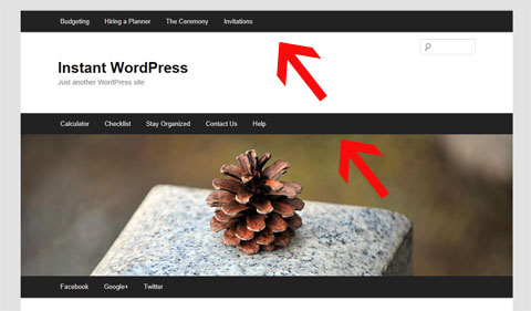
Now, instead of just having one menu below the main image (which I’ve
always thought looked a bit odd), you can have a menu at the very top
of your site and/or above the main image.
The picture below demonstrates where I’ve added the two optional
menus. I realize 3 menus is probably too much for most blogs. So you
can use the one(s) you want and disable the one(s) you don’t need using
the
Menu feature under the
Appearance tab in your Dashboard.
You can
download my theme here and use it if you like.
The good news is that it’s a child theme.
So that means it still uses the original Twenty Eleven theme’s
functionality. So when WordPress updates the theme files, you will still
receive the updates and not lose any of your own customizations.
Here’s a video that shows you how to activate and deactivate the two new menus I’ve created for my theme.
Popout
How to Improve Your Blog’s Navigation
Whether you use
my 3-menu theme
or not, this section is very important. I will show you how to make
your blog navigation more intuitive and useful by using static Pages and
the WordPress Menu feature.
You can apply these lessons to any theme, however if your theme only
has one menu then it may be more challenging (especially if you want to
highlight your post categories in your menu).
Let’s go back to the wedding planning example.
Instead of using your theme’s menu to highlight your post categories
that send people to a list of your random posts sorted by date, we are
going to create 4 static landing Pages that represent the 4 main topics
of your blog. These Pages will be linked from your main menu.
So in your WordPress Dashboard, go to
Pages and then select
Add New. Create your landing pages. For this example we will name them…
1) Budgeting
2) Hiring a Planner
3) The Ceremony
4) Invitations
The reason I am creating Pages instead of
Categories is because we will be highlighting these 4 topics on your
navigation menu. And when your readers click on any of the 4 topics
from the menu, they will be taken to a static landing page instead of a
dynamic page that displays a random hodgepodge of all your recent posts
(which is how most WordPress blogs are setup.)
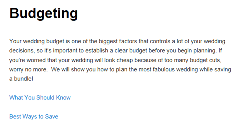
Here is what your first landing Page may look like.
We are going to add these landing pages to the WordPress Menu because
they contain important content that your visitors need to read.
The idea is we want these pages to remain visible on your blog no matter the date! That’s the purpose of static pages.
Notice the two links below the opening paragraph on the Budgeting
landing page. These are links to 2 more WordPress Pages that are
“children” of the Budgeting Page.
When you create a new Page in WordPress, you are given the option (in
Edit mode) of choosing a Parent for that page. So I created two more
Pages called
What You Should Know and
Best Ways to Save and assigned the Budgeting Page as their Parent. Then I linked them from the Budgeting landing page.
Note: You don’t have to assign a Parent to these pages, but it’s a good habit to get into because some themes (
Thesis) will automatically add your child pages as drop-down options in menus.
Now I’m going to show you how to highlight these important static pages on your theme’s navigation menu.
Using The WordPress Menu
When you go to the WordPress
Menu section (under
Appearance),
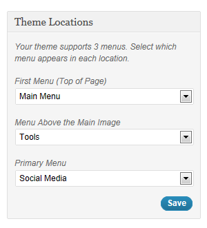
it will automatically tell you how many menus are available for your
theme. As I already mentioned, my child theme will give you three
menus. See below…
So we’re going to create a brand new menu on the very top of the blog
(you can call it whatever you want.) This menu is going to consist of
the 4 landing pages we just created (Budgeting, Hiring a Planner, The
Ceremony, Invitations) and any child pages you created.
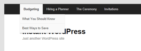
The child pages will show up as drop-down options underneath the main topic as illustrated below…
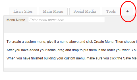
Once you’ve created your Pages, setting up this kind of menu is super easy. Just go to
Menu under the
Appearance tab in WordPress and click the + sign to create a new menu.
Name the menu whatever you’d like. I named mine “Main Menu” since
it’s at the top of the blog and links to my most important topics.
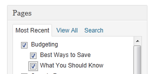
Now you’re going to add your 4 new landing Pages (and their children)
to the menu by scrolling down to the Pages section and selecting all
the appropriate pages. See screenshot below where I’ve selected the
parent Page “Budgeting” and all its children.
Now we want to make sure the child pages show up as drop-down options when you hover over
Budgeting. You do that by simply dragging all the child Pages over to the right so they are indented. See screenshot below…
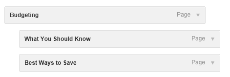
Repeat this for all the Pages and children you want to add to this menu. Save your menu when you are done.
Now when you refresh your blog you should see your main topics in the new menu. When you click the main topic (
Budgeting, for example) it should go to the static landing Page you created.
When you hover over each topic, it should also display the child pages as drop-down options.

What About My Posts and Categories?
Don’t worry. I’m not suggesting you abandon creating Posts and using
categories. Obviously you still want to keep creating and highlighting
new content.
I’m just trying to help you improve your blog’s navigation so your
readers can find your most important (static) content. When you have a
tutorial/how-to site there is certain content that should always be
accessible. That’s why you want to make good use of Pages and highlight
them from your menu(s).
There are a few ways to highlight your recent posts and categories on your menu:
1) Simply add the Categories to your menu like you did the Pages above
2) Use my
Twenty Eleven child theme and reserve one of the extra menus for your Categories
3) Create a new Post category called “News” or “Updates” and make all
your existing Post categories children of this new category.
Add the “News” category to one of your menus and the sub categories
as drop-downs underneath. Now your readers can find your most recent
posts and view by category if they wish.
Now you’ve got the best of both worlds with WordPress. You can
feature your most important and potentially highest-converting static
content while continuing to highlight your recent work (latest posts).
Benefits of Implementation
- Static pages make your blog easier to reference and they improve your visitor’s overall user experience.
- When your navigation is logical, your readers can find what they
need and they are more likely to return to reference your content. They
will also stay longer and view more pages (improves your bounce rate).
- When people return, they are much more likely to buy products you recommend and sell, which will increase your blog’s revenue.
- This can also be beneficial for search engine optimization because
your content is organized logically and it gives the engines a better
idea for what your site is about. Having more static pages can
potentially boost your search engine traffic in the long-run.
What About Other Themes?
I chose this theme because it’s the WordPress 3.0 default and
everyone has easy access to it. Unless you’ve removed it, you should
still have it installed. Also, it would be quite difficult to explain
this for every theme since the code is drastically different.
This is a great example of when premium themes like Thesis
come in handy. You can actually create drop-downs in your navigation
menu without having to edit the WordPress Menu. It’s part of the Thesis
Options panel. So Chris Pearson was actually ahead of the game when he
created Thesis. 
The Twenty Eleven theme also has extremely clean code and is a good
theme to use if you’re interested in learning more about theme
development and modification. You can really do a lot with this theme
if you spend time learning about the inner workings (hooks) of
WordPress.
——————————
I really hope you found this post useful. I know it was lengthy, but
I want you to understand how important site usability really is. If
you need a theme with more menu support, be sure to
download my Twenty Eleven child theme.
Good luck and I look forward to hearing how this works for you.

Oct 3, 2011 5:30 PM
If you
follow my Facebook page, you may have seen the picture I posted last week of myself and Tai, who playfully calls himself “The Asian Wonder.”

We met at a local WordPress meetup on September 24th.

Tai approached me at the end of the session to let me know that he
recognized me from YouTube. He eagerly opened his laptop and revealed
his recent earnings with the YouTube Partner program.
His excitement was refreshing, and he really wanted me to share his story with my audience.
Even though Tai’s YouTube earnings aren’t through the roof (yet),
they are proof of what is possible. If you can earn $30 per month then
why can’t you triple that next month, and then triple it again the
following month?
I can recall my first $14 commission check I earned back in 1998. I was still in college, so $14 felt like a million dollars.

And I remember thinking, “If I can make $14, I can make $28. And
when I made my first $100 I knew I could double that and so on. There’s
something so motivating about seeing the fruits of your labor no matter
how small the amount.
Tai’s Story
You have to meet Tai in person to appreciate his energy, but you’ll get a sense with his colorful e-mail below.
Yo Lisa,
It was good meeting you at the WordPress Meetup this past weekend!!!
Thanks for all your words of encouragement for a beginner such as myself in the internet marketing biz.
When I first got into internet marketing in late 2009, I thought
that Adsense was a joke and a scam cuz I had never met anyone in real
life who had made money from it.
But then I ran into your YouTube video on “How To Make Money With Google Adsense”
at the beginning of this year and I liked how you kept it real and it
didn’t sound like a bunch of hype and B.S. so I put aside my limiting
beliefs and gave it a try.
I don’t have a lot of time because of my day job so I got motivated to do youtube videos for my fitness niche after I watched your “44 YouTube Videos & 8400 Subscribers” since it’s easier for me to demonstrate on video how to work out versus writing about it.
I took my sweet ass time to implement your advice but after
making over 80 youtube fitness videos, I finally got invited to monetize
my youtube videos 4 months ago, however, my retarded ass never bothered
to submit my videos to youtube for monetization until 2 months ago when
I asked my girlfriend to set aside a day to submit all my fitness
videos for monetization on 8-21-11 and BAM!…
Immediately I started making money the very NEXT day! (See Below) I couldn’t believe it!
 I know you and others have been saying it all along that it was
not B.S., but for some reason it seemed more real when the adsense money
started rolling in.
Now don’t get me wrong, it’s not a whole lot as you can see in
the screenshot below, however, it is a HUGE start for me and has boosted
my confidence tremendously simply by knowing that I’m gonna be making
at least $30/month of steady passive income without me having to do
anything. And it’s only going to get better with time. WHOOOPEEEE!!!!
I’m ballin’ now! lol
 Looking back in retrospect, the biggest mistake I made when I
first got started was I didn’t have enough belief that it would work for
me and the other thing was that I did not take enough ACTION!
Let your audience know that they got to get off their ass and TAKE ACTION!!!!!
Whoever takes more action and implements more of what you talk about will simply get more results.
I will keep you posted with my progress so that you’ll know that someone out there is listening and taking action!!! BOOYAH!!!
Peace
Tai “The Asian Wonder”
Your Online Personal Trainer
www.PersonalTrainerTai.com
I hope you weren’t offended by Tai’s choice of words, but I wanted to
post the e-mail “as is” for effect and realness. As you can probably
tell, Tai’s an energetic person and now he is channeling that energy to
improve his online business through video.
Just Do It!
The biggest takeaway from Tai’s story is obviously,
just do it! Even if you have no interest in YouTube and the partner program, this message can apply to any venture.
How many things have you put off because you feared failure or you
assumed it wouldn’t work? Are you sabotaging your business because you
lack belief and confidence?
I hope Tai’s story provides the motivation you need to get moving on tasks you’ve been putting off!
Sep 29, 2011 4:27 AM
by lisa
You
don’t typically hear from me twice in one week, but my stats show how
much you guys love AdSense-related posts, so I hope you don’t mind a
double dose of Lisa this week.

I was playing around in the AdSense Performance reports as I often
do, and decided to create a few graphs showing the breakdown of
different earnings by category so we can compare our stats. Here are
the ones I focused on:
- % of Earnings by Unit Size
- % of Earnings by Ad Type
- % of Earnings by Targeting Type
- % of Earnings by Product
If you haven’t switched over to the new interface (which isn’t so new
anymore), then you’re missing some great reports — especially if you’re
a stat junky like me.
In November, they will be shutting off the old interface and you will
be forced to use the new one. So you might as well get acquainted if
you haven’t already.

So let’s start with the first report I ran…

One of the reasons I redesigned my
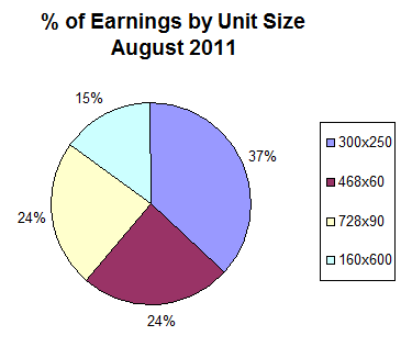
static site was because I wanted a column to accommodate larger widgets, images and the 300×250 AdSense unit. Many of you
told me how well the unit converted for you and boy were you right!
My CTR (click through rate) for the right column unit on 2 Create a
Website increased by 65% and my Page RPM (page revenue per 1,000
impressions) increased by 59% in August. I also switched from all text
ads to text
and image ads.
The new 300×250 unit was the biggest reason for my record month in August 2011.
For awhile, the 728×90 unit was winning consistently, but it tied for 2nd place last month.

Text ads have always performed best for me so this is no shocker.
But I will say that text and image ads on my static site outperform my
blog by far. Text ads performed so poorly on my blog, it wasn’t even
worth the time and space.
My blog tends to receive traffic from a lot more savvy users
(particularly IMers, seasoned Webmasters and bloggers, etc.) compared to
my static site. In general, these people are less likely to click on
ads. And of course, traffic has a lot to do with it as well. My static
website receives a lot more traffic than my blog.
The 728×90 unit is the only one that converts here. I don’t get that
many clicks, but my Page RPM (page earnings per 1,000 impressions) is
fairly high and makes it worthwhile.
 Contextual Ads
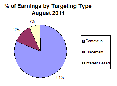
I would imagine most of you probably earn more from contextual ads
like me. These are the ads that are simply targeted by page content.
In general, ads with the best bid and quality score end up on your site.
Placement Ads
Placement ads can earn you more per click because these
advertisers are willing to outbid all the contextual advertisers to place an ad on your site
specifically. It’s very important to ensure your site is optimized and accessible to placement advertisers.
To do this go to “My Ads”, click “Custom Channels” and click the channels you want to make “targetable.” Next to Targeting, check the box that reads “Show this custom channel to advertisers as a targetable ad placement.”
Prior to doing this, (last Summer) my percentage of earnings from
placement ads was 6% of my overall earnings. It is now 12%. That’s a
100% increase. So make sure you set your channels to “targetable” and
become accessible to people who want to bid exclusively on
YOUR site.
Interest-Based Ads
These are ads that show up based on where the user has visited. So
if they were on a car website before coming to your site, they may see a
car ad even though your website is not about cars.
I have turned off Interest-Based ads in my account (Under “Allow and
Block Ads” / “Advanced Settings”), but I learned that 3rd party networks
can still serve them up. So that explains the 7% in earnings even
though I have opted out of Interest-Based ads.

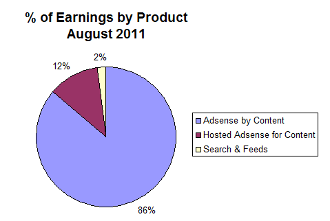
This report shows that most of my earnings come from the Contextual
ads and images on my site. Hosted AdSense for Content is related to the
YouTube Partner program and other 3rd party ads that may show on your
site.
This breakdown has been pretty consistent for me over the years.
There was a slight increase in the Hosted AdSense for Content over the
past year (YouTube), but nothing major. I combined Search and Feeds
because they were roughly the same and so low compared to the other
categories.
What About You?
So how does your breakdown compare? Any similarities?
Keep in mind, the reporting Interface doesn’t breakdown the
percentage. I just did some simple math to figure that out, and I
created the pie charts in Excel to make everything easier on the eyes.

I’d love to hear from you. Let’s chat!


 You
don’t typically hear from me twice in one week, but my stats show how
much you guys love AdSense-related posts, so I hope you don’t mind a
double dose of Lisa this week.
